Ordermentum
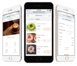
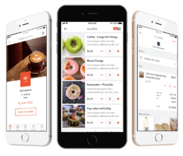
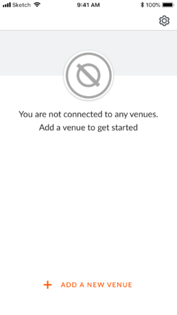
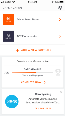
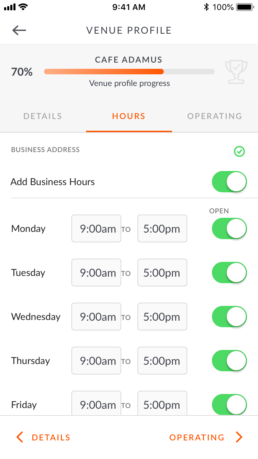
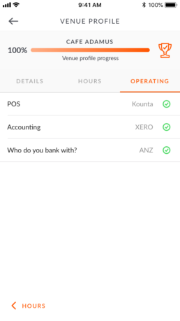
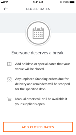
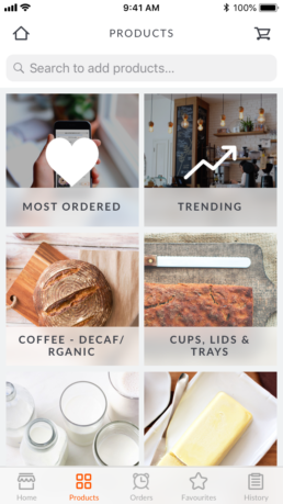
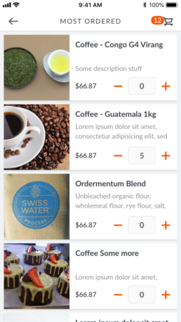
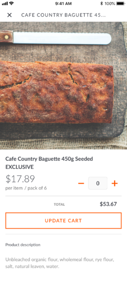
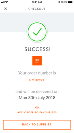
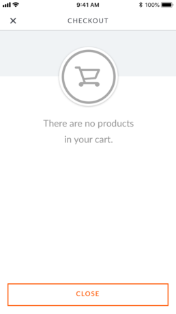
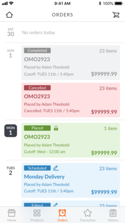
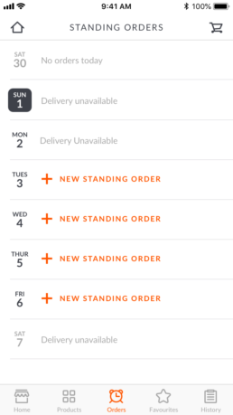
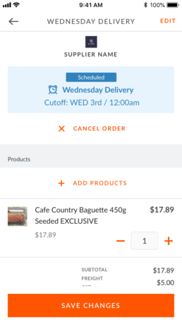
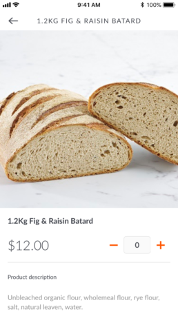
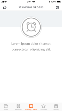
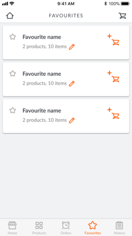
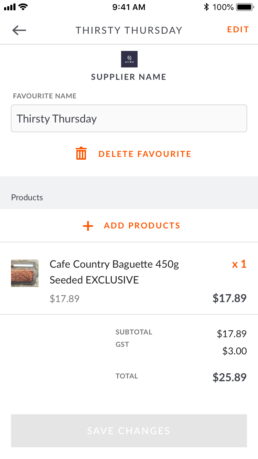
Ordermentum (founded in 2014) is Australia’s leading B2B ordering, payments, and insights platform for the food and beverage industry. At the time of my initial engagement, the platform consisted of a website for Suppliers to manage their orders, payments and products, as well as a responsive website for Retailers to search and buy products from their connected Suppliers. My initial role as UX/UI Designer was to review the current offering to Retailers and design the native iOS product to market, including research to improve the experience as apply mobile specific design for the UI and visual design.
ClientOrdermentumRoleUX, UI and Visual DesignYearMAY 2018 - MARCH 2019Linkwww.ordermentum.com
Review current state
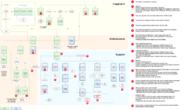
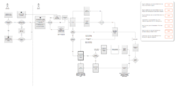
As a detailed sitemap did not exist, first task was to map out the application and highlight bugs and areas for concern in regards to user experience.
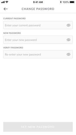
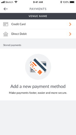
Redesign Payments Settings
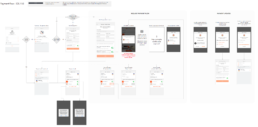
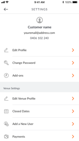
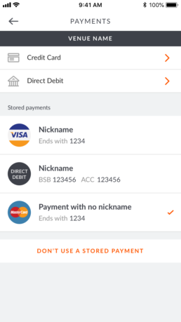
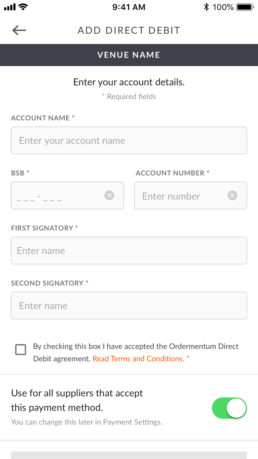
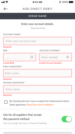
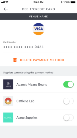
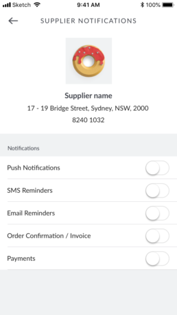
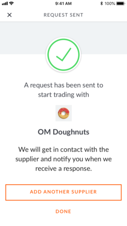
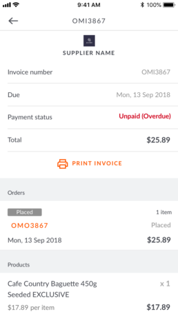
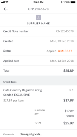
The previous flow of managing payment methods were seperate per Supplier and were located individually within each Supplier settings. I redesigned and user tested a new flow to manage the payment method(eg. Credit Card) top down across multiple suppliers within the new ‘Payments’ section. Additional features were also explored such as sending requests to a Supplier to accept a new payment method and receiving updates on status.
Review of Onboarding for Retailers
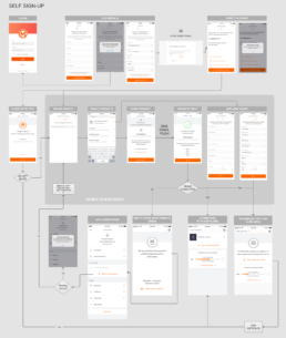
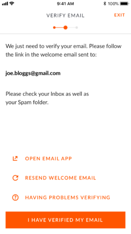
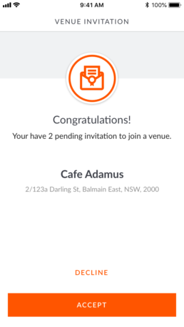
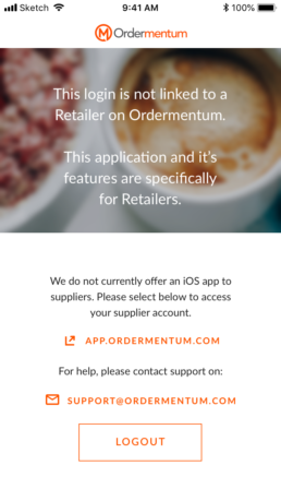
The majority of retailers were typically introduced to Ordermentum by their suppliers, who would invite them to the platform to start trading. As self sign-up was planned for the future, an analysis of all potential variations(current and future) for on-boarding was created.
Self Sign-up
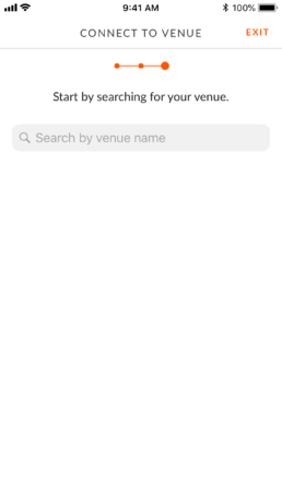
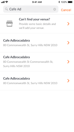
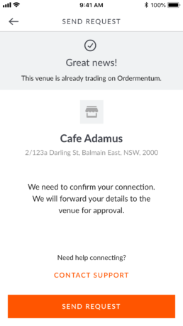
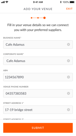
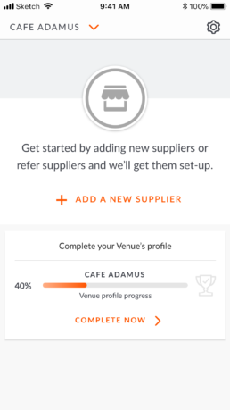
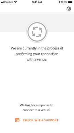
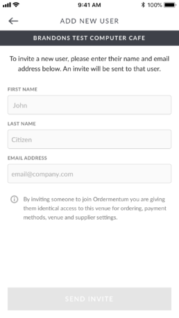
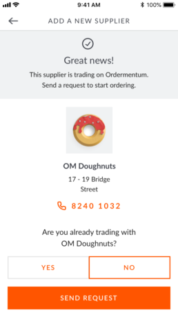
The following use cases needed to be considered when designing the MVP user flow for self sign-up, including issues with creating duplicate venues.
- New user wants to add their venue to Ordermentum
- New user that has an invitation from a Supplier to a venue on Ordermentum
- New user that wants to connect to a venue that exists on the Ordermentum platform
User Testing
In addition to regular internal testing, 5 participants that managed Retail venues and were actively using the mobile responsive version of Ordermentum were user tested with a iOS prototype built in Axure.
Key areas of tested were;
- How are you (customer) introduced to the web/app currently
- Overview on current solution / pain points / usage
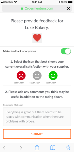
- Retailer / Supplier – communication / expectations
- What the future may look like..
Prototype / user testing
- OM Home – what content/features may have potential value
- Supplier Home – what content/features may have potential value
- Payments and ordering – User flow
- Pop-up modals
Interactive prototype built in Axure (try me!)
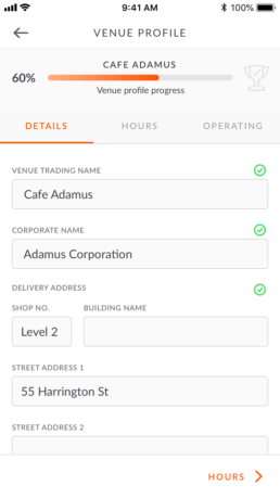
UI and Visual Design
Before and After
